Choosing a paint color in Miami is less about what looks good on a swatch and more about what stays beautiful in intense sunlight, sea glare, and high humidity. The same beige that feels calm in a showroom can flash pink on a bright Florida afternoon, while a trendy blue can look louder and flatter on an exterior wall than expected. This guide breaks down the best paint colors for Miami homes—starting with why Miami’s unique light changes everything, then moving through exterior paint choices by architectural style, durability in a coastal Climate, and finally interior colors that keep your Miami home feeling bright, serene, and cohesive.
- Why Miami’s Light Makes Paint Color Look Different (UV, sea glare, and undertones)
- Best Exterior Paint Colors for Miami Homes by Architectural Style (Art Deco, Mediterranean Revival, modern coastal)
- Salt Air, Humidity, and Heat: Exterior Paint Color Choices That Stay True Longer
- Top Exterior Color Palettes for Miami (serene neutrals, coastal pastels, terracotta accents, crisp whites)
- Trim, Roof, and Front Door Pairings That Make Exterior Paint Colors Work in Miami
- Best Interior Paint Colors for Miami Homes (light-reflective neutrals, soft greens, airy blues)
- Room-by-Room Guidance: Condos vs Single-Family Homes, Furniture/Textiles, and Color Temperature
- How to Choose the Right Paint Colors for Your Miami Home: Sampling, timing, and common mistakes
- Frequently Asked Questions
Why Miami’s Light Makes Paint Color Look Different (UV, sea glare, and undertones)
“Miami light” isn’t a myth—it’s a specific mix of physics and surface reflection that changes how color is perceived. South Florida sits closer to the equator than most of the U.S., so the sun angle is higher for more of the day. That means more direct light, more Ultraviolet exposure, and fewer soft shadows to help you read depth and Hue. Add reflective Sea glare, bright white pavement, pools, and pale sand, and you get an environment that increases perceived brightness and can wash out mid-tones.
A few Miami-specific effects to know before choosing exterior paint or interior paint:
- UV + high sun angle can “bleach” mid-tone paint colors. Many exterior paint colors that look balanced in other regions read lighter and less complex in Miami’s intense sunlight.
- Glare from water and hardscape shifts perception. White pavers, light concrete, and pool decks bounce light upward, often pushing walls warmer or cooler depending on their undertones.
- Darker hues can look flatter and “hotter.” On the exterior, deep colors absorb heat and can appear less dimensional because glare reduces visible texture. They can still work, but typically better as accents than as a full-body exterior paint color.
To judge any paint color for your Miami home, use three criteria that interior designers and color consultants rely on:
- Undertones (more important than the color name): A “warm white” might have pink/peach undertones, while another warm white might lean toward yellow. A “light gray” might carry green or blue. In Miami Lighting, undertones show up fast—especially next to tile, stone, and landscaping Green.
- LRV (Light Reflectance Value): Higher LRV generally helps exteriors manage heat and keeps homes looking crisp in the Florida sun, but extremely high LRV can also amplify glare. Many Miami exterior paint choices land in a high-but-not-blinding range, then rely on trim and accents for definition.
- Metamerism (color shifting under different lighting conditions): A paint color can match perfectly in store lighting and then shift at home. Morning shade, noon sun, sunset warmth, and LED interiors all change how paint colors appear—especially pale neutrals and blue-grays.
Once you understand why paint colors in Miami Beach and across Miami’s neighborhoods look different in real life, it becomes easier to choose colors that fit the architectural style of your home—and still look right as the day (and light) changes.

Best Exterior Paint Colors for Miami Homes by Architectural Style (Art Deco, Mediterranean Revival, modern coastal)
The best exterior paint colors for Miami homes usually start with your home’s architectural style. Miami’s iconic neighborhoods reward historically aligned palettes—but the trick is tuning saturation so colors don’t turn neon under intense sunlight.
Art Deco (Miami Beach classics)
Art Deco homes and buildings are built for contrast and graphic clarity. They look best with clean, optimistic color families—often light, often pastel, and almost always paired with crisp trim.
- Best color families: crisp whites, pastel shades, mint/seafoam, pale aqua, soft coral, gentle buttery tones
- Trim strategy: bright or clean white trim to sharpen lines; occasional darker banding for emphasis
- Miami adjustment: reduce saturation slightly so a pastel stays elegant instead of screaming in full sun
Mediterranean Revival homes
Mediterranean Revival homes look most authentic with warm, earthy hues that complement stucco, clay roof tiles, and lush landscaping.
- Best color families: warm whites, sand/beige, warm greige, muted ochres, soft clay tones
- Accent strategy: darker bronze/espresso accents for windows, wrought iron, or shutters
- Miami adjustment: choose slightly “dustier” (lower-chroma) versions of terracotta and ochre to reduce UV-driven fading and keep Aesthetics timeless
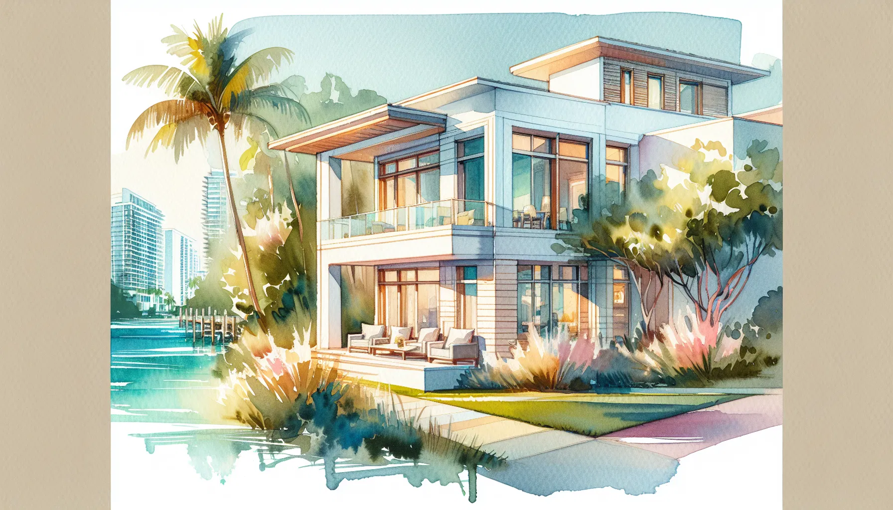
Modern coastal homes
Modern coastal homes succeed with restraint: light, airy bodies and minimal contrast that still reads intentional. These palettes also suit many Miami condo buildings and contemporary renovations.
- Best color families: clean whites, light greiges, airy blue-grays, soft sages, pale taupes
- Trim strategy: minimal contrast (body and trim close in value) for a seamless look
- Miami adjustment: avoid stark, icy grays that can turn green in coastal light; pick neutrals with stable undertones
Style is the first filter. The next is performance: exterior paint in South Florida faces salt, humidity, and heat that can shift color, stain surfaces, and shorten how long an exterior paint color stays true.
Salt Air, Humidity, and Heat: Exterior Paint Color Choices That Stay True Longer
Miami’s climate doesn’t just fade paint—it changes what “clean” looks like over time. Even the right paint can chalk, stain, or dull if the color choice fights the environment.
Here’s what actually damages exterior paint in South Florida:
- Salt air and salt crystals: Salt can settle on walls and subtly abrade surfaces. Over time, it contributes to chalking—that powdery residue that makes an exterior look faded even if the pigment hasn’t fully broken down.
- Humidity and mildew: High humidity levels, plus shaded areas (often north-facing walls or under heavy landscaping), create the perfect conditions for mildew staining. Lighter colors can show it sooner, but darker colors can look patchy as they fade unevenly.
- UV breakdown of binders and pigments: UV attacks the binders that hold pigment, which is why some hues lose richness faster. In many exterior systems, reds, violets, and some bright blues are more prone to noticeable fading, especially on sun-facing walls.
Before you fall in love with a palette, a few selection rules help your exterior paint color stay stable:
- Favor lighter colors and slightly grayed (lower-chroma) hues for better fade resistance and heat management.
- Keep ultra-saturated colors for small accents (front door, shutters) rather than large wall areas.
- Choose exterior paint lines rated for UV resistance, and specify mildew-resistant additives when appropriate—especially on the shaded sides of the home.
- If your home has strong reflectors (pool water, white fences, pale pavers), expect the paint color to appear brighter and sometimes warmer than you planned.
With durability risks in mind, you can choose from proven paint colors for your Miami exterior that balance coastal Beauty with real-world longevity.
Top Exterior Color Palettes for Miami (serene neutrals, coastal pastels, terracotta accents, crisp whites)
Instead of chasing a single “perfect” paint color, it’s smarter to choose a harmonious color scheme: body + trim + accent. That’s how Miami homes read polished in harsh light—because the palette creates definition even when glare reduces contrast.
| Palette type | Body | Trim | Accent (door/shutters/metal) | Where it works best |
|---|---|---|---|---|
| Serene neutrals | warm off-white or light greige | clean white | charcoal or deep bronze | modern coastal homes, condos, renovations |
| Coastal pastels | pale aqua or sea-glass | bright white | navy | Art Deco, smaller facades, playful coastal homes |
| Terracotta accents | sand beige | creamy white | terracotta door | Mediterranean Revival homes, stucco exteriors |
| Crisp whites | soft white body | ultra-white trim | black or teak | heat management, “Miami clean” look, high-sun sites |
A few practical notes for choosing the right palette:
- Serene neutrals look expensive in Miami because they absorb less visual noise from reflections. A warm neutral body also helps landscaping Green look richer rather than harsh.
- Coastal pastels are a Miami signature, but they’re easiest to control when the pastel is lighter and slightly muted. Pastel shades can truly transform your Miami home—especially when trim is clean and consistent.
- Terracotta accents read authentic when the wall color stays sandy and quiet. Let the terracotta show up in a door, a niche, or a small architectural moment rather than the entire exterior.
- Crisp whites are the safest choice for heat and resale, but the key is choosing a soft white body so the home doesn’t look blown out at noon.
Once you’ve selected a palette, the exterior only looks finished when trim, roof, and front door colors are paired to handle Miami glare and create clear architectural definition.
Trim, Roof, and Front Door Pairings That Make Exterior Paint Colors Work in Miami
In Miami, pairing matters as much as the base exterior paint. Glare can erase subtle transitions, so you need enough contrast to outline the architecture—without creating harsh edges that look overly bright.
Trim in full sun: Pure, high-chroma white trim can look “blown out” under the Florida sun, especially on south- and west-facing elevations. A slightly softened white often reads cleaner because it preserves edges. The goal is definition, not glare.
Front doors that anchor bright exteriors: A deeper door color gives the eye a place to rest. It also holds up visually when the body color is light-reflective.
Good Miami door anchors include:
- navy (coastal and classic)
- deep green (pairs beautifully with tropical landscaping)
- espresso (ideal for Mediterranean Revival homes)
- black (best with crisp whites and modern coastal palettes)
Undertone matching (the hidden make-or-break): If the body has warm undertones and the trim is a cool white, the home can swing pink/green depending on different lighting conditions. Matching undertones keeps the exterior color stable from morning to sunset.
Roof and hardscape coordination shortcuts: Your roof tile and driveway are massive color influences—often more powerful than nearby landscaping.
- Terracotta roofs prefer warm undertones: cream, sand, warm greige, and many beiges.
- Gray roofs pair best with cool whites, blue-grays, and neutral greiges (not yellow-leaning).
- Pavers and driveways act like reflectors: pale concrete can brighten and cool the walls; warm brick pavers can push the exterior paint color warmer than expected.
With curb appeal decisions set, the same Miami lighting logic applies indoors—especially when selecting paint colors that keep the Interior design feeling calm, spacious, and consistent.
Best Interior Paint Colors for Miami Homes (light-reflective neutrals, soft greens, airy blues)
Interior paint in a Miami home has two jobs: managing abundant natural light and creating a sense of tranquility when the outdoors is visually intense. The best results usually come from light-reflective neutrals plus a restrained coastal Hue family.
Light-reflective neutrals (the foundation): Warm off-whites, soft beiges, and pale greiges keep the space airy without turning sterile. In Miami, neutrals with warm undertones often feel more natural against sunlit floors and coastal textures, but they must be chosen carefully to avoid peachy or pink shifts.
Soft greens (coastal landscaping indoors): Sage and sea-glass greens echo palms and tropical planting, which helps the interior feel connected to the exterior. These greens also read restful in bedrooms and living areas, especially in homes with lots of glass.
Airy blues (cooling without feeling cold): Misty blue and blue-gray tones can reduce the perception of heat and bring calm to bright rooms. In Miami lighting, the best blues are often slightly grayed so they don’t turn candy-bright.
A light-direction detail most homeowners miss:
- East light can make neutrals look warmer by mid-morning.
- West light intensifies warmth late in the day, sometimes turning beige more golden.
- North light can pull grays greener, which is why undertones matter more than the label on the paint can.
After you choose a core interior direction, apply it differently based on the layout—because a Miami condo and a single-family home handle light, furniture, and color temperature differently.
Room-by-Room Guidance: Condos vs Single-Family Homes, Furniture/Textiles, and Color Temperature
The “right paint” is contextual. A color that looks serene in a single-family living room can feel flat in a Miami condo hallway, and a trendy neutral can clash with fixed finishes like marble, porcelain, or warm woods.
Condos vs. single-family homes: Condos often benefit from continuous lighter colors to visually expand space and reduce shadow lines created by narrower rooms and long corridors. In a Miami condo, keeping one neutral family across the main areas can make the entire home stand out larger and more harmonious.
Single-family homes can handle gentle shifts—still within one family—because there’s more separation between zones. A soft greige in the main living area can transition to a slightly warmer beige in bedrooms without feeling choppy, especially in open-plan home design with strong window walls.
How furniture and textiles steer paint color: paint doesn’t exist in isolation; it reflects what’s in the room.
- Cool marble/porcelain floors and chrome finishes push wall colors toward cooler tones; many neutrals read more gray or even slightly green.
- Warm woods, rattan, and woven Textile pieces pull neutrals warmer and make off-whites feel creamier.
- Bold art deco patterns can handle cleaner whites and higher contrast.
- Linen and coastal textures typically look best with warm undertones and muted hues rather than icy whites.
Color temperature by room (a practical lens): Bedrooms and primary suites often benefit from slightly warmer or softer hues to feel restful at night under artificial Lighting. Kitchens with white cabinets can tolerate a warmer wall neutral to prevent the room from feeling clinical, while home offices with strong daylight may do better with a balanced greige or soft blue-gray to reduce glare.
With room-specific choices in place, the final step is validating paint colors in real Miami conditions—because sampling and timing are what separate a good choice from a paint color you regret.
How to Choose the Right Paint Colors for Your Miami Home: Sampling, timing, and common mistakes
Choosing paint colors for your Miami home is an exciting start to your home transformation moment—but Miami’s unique light punishes shortcuts. Use a simple process that accounts for UV, glare, and metamerism, so your paint choices stay harmonious year-round.
Step-by-step selection process
- Narrow to 3–5 candidates per space (or per exterior palette) based on undertones and LRV, not just trend.
- Paint large samples (at least poster-size) on multiple walls. For exterior paint, sample both a sun-facing and shaded area and place one sample near a strong reflector (pool, white fence, pale pavers).
- Check at multiple times: morning, noon, sunset—and under your actual interior bulbs at night. This is where different lighting conditions reveal undertones.
- Compare against fixed finishes: roof tile, stone, flooring, countertops, and key furniture. If the undertones clash, the paint color will look “off” no matter how pretty it seemed on its own.
- Finalize one cohesive palette (body/trim/accent outside; main neutral + supporting hues inside) and commit to consistent sheen and product quality for durability in humidity.
Common Miami mistakes to avoid
- Choosing colors only from indoor swatches (ignores UV and Sea glare).
- Going too saturated on sun-facing exteriors (fades faster and looks louder).
- Mismatching undertones between walls, trim, tile, and fixed finishes—creating pink/green shifts that appear as the day changes.
- Treating the driveway or pool deck as “neutral.” In Miami, hardscape reflection can influence your paint color more than you expect.
After sampling and confirming undertones across your exterior and interior, you can confidently choose the right paint colors—and schedule painting, knowing your Miami home will keep its Beauty through intense sunlight, coastal weather, and everyday living.
Frequently Asked Questions
What are the best paint colors for Miami homes to reflect the city’s vibe?
For the best paint colors for Miami homes, think bright, tropical-inspired palettes: soft pastels like coral, seafoam, sandy beige, and light turquoise alongside crisp whites. These light colors keep interiors airy and reflect sunlight, while vibrant colors can be used as accents to convey Miami’s energetic style. The right paint colors can truly capture the city’s sunny, coastal spirit.
How do light colors perform in Miami’s strong sunlight and humidity?
Light colors are ideal in Miami because they reflect heat and reduce glare, helping interiors stay cooler. Under intense sun, paint colors can appear lighter and slightly washed out, so test samples outdoors at different times of day. Also choose durable, mildew-resistant finishes formulated for humid climates to protect color longevity.
Should I choose vibrant colors or muted tones for a Miami home?
Both work well depending on your home and neighborhood. Vibrant colors suit exterior facades and accent walls, creating a bold Miami look, while muted tones and pastels provide a timeless coastal aesthetic. Let your personal style guide your color choices: combine a neutral base with pops of vibrant color for balance.
How can I select colors that increase curb appeal in Miami neighborhoods?
Select colors that complement local design trends and your house’s architectural style. For Mediterranean or Art Deco homes, consider historic palettes or pastel hues. For modern homes, crisp whites and cool grays with colorful doors or trim create contrast. Test small swatches on exterior walls and view them at different times of day to ensure the home presents well to potential buyers.
How do I create a cohesive color scheme between interior and exterior spaces?
Start with a unifying undertone—warm or cool—and select complementary colors for interiors and exteriors. Use recurring accent colors in doors, shutters, trim, and key interior pieces to tie spaces together. A cohesive scheme helps your home feel intentional and can make it easier for guests to move seamlessly between outdoor and indoor living spaces.
How much should personal style influence my paint choices in Miami?
Your home should reflect your personal style, but balancing individual preferences with local context and resale considerations is wise. If you love bold hues, use them in focal areas like an entryway or a feature wall while keeping larger surfaces in timeless light colors to maintain broad appeal.
What practical tips help paint colors last longer in Miami’s climate?
Choose high-quality, UV-resistant exterior paints and mildew-resistant formulations for humid conditions. Proper surface preparation, priming, and applying the recommended number of coats will also help. Lighter shades help hide sun-related fading, and regular maintenance—cleaning and touch-ups—will extend the life of your chosen palette.
How can paint colors truly transform a small Miami apartment?
Paint colors can truly transform small spaces by using light colors on walls and ceilings to make rooms feel larger and more open. Strategic use of vibrant accent colors can add depth and personality without overwhelming the space. Mirrors and glossy finishes also help bounce light and enhance the effect of your color choices.
Do local design trends in Miami affect which colors I should pick?
Yes—local design trends often lean toward coastal pastels, bright accents, and Art Deco-inspired palettes. While trends can guide your selections, prioritize colors that work with your home’s architecture and natural light. A classic palette with one trendy accent color offers a modern but lasting look.
How do I test paint colors to ensure they look right at different times of day?
Paint a few large swatches on different walls and observe them at morning, midday, and evening light. Because paint colors can appear different in direct sunlight and shade, checking at multiple times ensures you choose hues that consistently achieve the mood you want. Use sample pots to live with the colors for a week before committing.